Color Theory Decoded: Why Some Designs Just “Feel Right”
Everyone has had the experience of looking at two versions of the same design and instantly preferring one, without being able to explain why. One poster feels calm and trustworthy, another feels chaotic. One app icon feels premium, another feels cheap. More often than not, the difference comes down to color, and more specifically, to a set of relationships between colors that the human eye has been trained, both biologically and culturally, to read as harmonious or jarring. Color theory is simply the study of those relationships, and understanding even the basics can turn “that just feels right” into a repeatable, intentional design decision.
The Color Wheel Is the Foundation of Everything
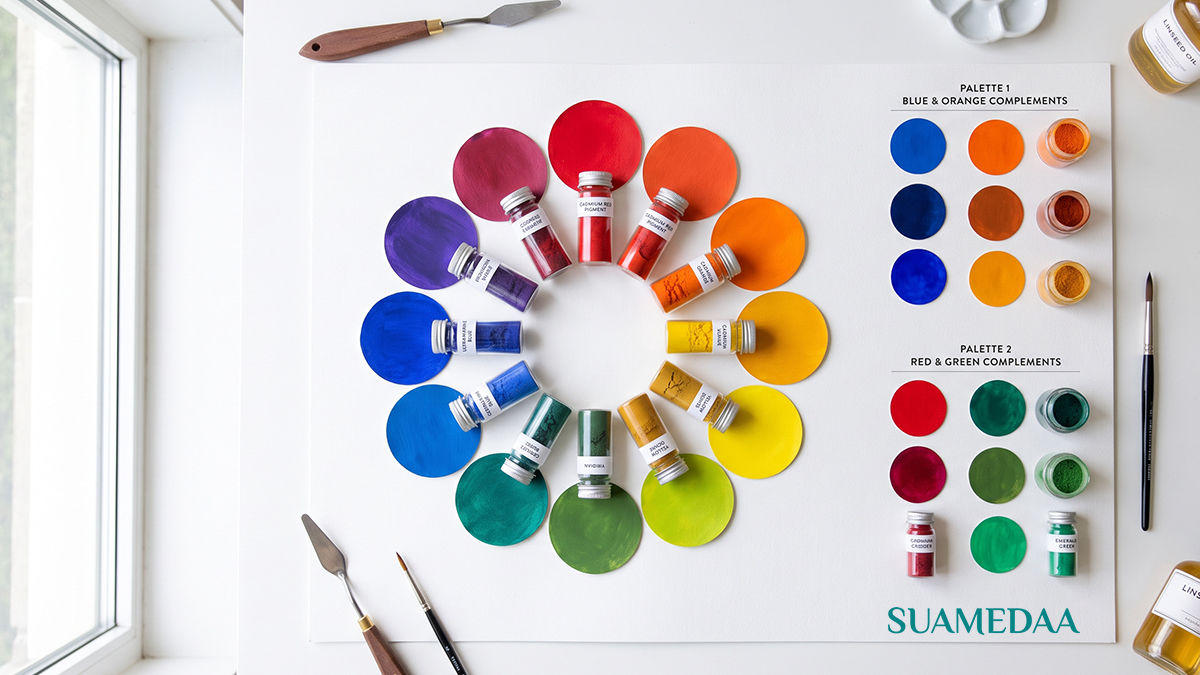
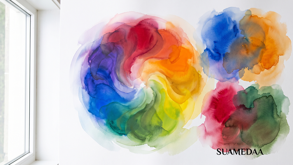
Nearly every rule in color theory traces back to the color wheel, a circular arrangement of hues that shows how colors relate to one another based on their position. Red, yellow, and blue sit as the primary colors, evenly spaced around the wheel. Mixing adjacent primaries produces the secondary colors, orange, green, and violet, and mixing a primary with its neighboring secondary produces the six tertiary colors that fill in the rest of the wheel. This simple structure gives designers a map for building color relationships that has stayed remarkably consistent since the wheel was first formalized by Isaac Newton in the seventeenth century.
Why Certain Combinations Feel Harmonious
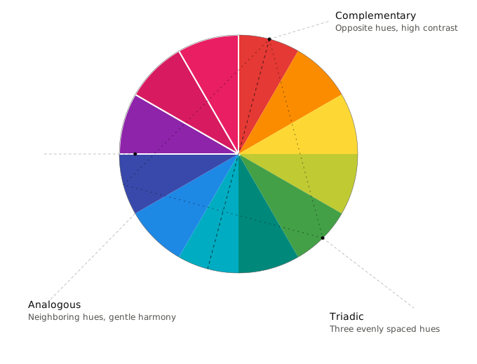
The wheel isn’t just a reference chart, it is a tool for identifying specific types of relationships, each of which produces a different emotional effect.



Complementary colors sit directly opposite each other on the wheel, such as red and green or blue and orange. This pairing creates the highest possible contrast, which is why it shows up so often in sports branding, action movie posters, and calls to action that need to grab attention immediately. The tension between opposing colors is what gives complementary schemes their energy, but used carelessly, that same tension can feel loud or visually exhausting.
Analogous colors sit next to each other on the wheel, such as blue, teal, and green. Because these hues share an underlying similarity, analogous schemes tend to feel calm, cohesive, and naturally pleasing to the eye. This is the palette behind most nature inspired designs, wellness branding, and any interface that wants to feel soothing rather than urgent.
Triadic colors are three hues spaced evenly around the wheel, forming a triangle, such as red, yellow, and blue. Triadic schemes offer strong visual contrast while still feeling balanced, since no single color dominates the composition. This makes them a popular choice in playful branding and illustration, where vibrancy matters but the overall effect still needs to feel intentional rather than random.
Each of these relationships produces a genuinely different feeling, and much of what separates an amateur color choice from a professional one is simply picking the relationship that matches the emotional goal of the design, rather than picking colors that merely look nice in isolation.
Warm and Cool: The Emotional Temperature of Color
Beyond specific hue relationships, colors carry an emotional temperature. Warm colors, reds, oranges, and yellows, tend to feel energetic, urgent, and appetizing, which is part of why so many fast food chains lean on red and yellow branding. Cool colors, blues, greens, and purples, tend to feel calm, trustworthy, and professional, which explains their dominance in banking, healthcare, and technology branding. Neither temperature is inherently better, the right choice depends entirely on the emotional response a design is trying to produce. A meditation app built around fiery reds and oranges would feel deeply out of place, just as a fast food brand built entirely around pale blues would struggle to convey the urgency and appetite appeal the category depends on.



Saturation and Value Matter Just as Much as Hue
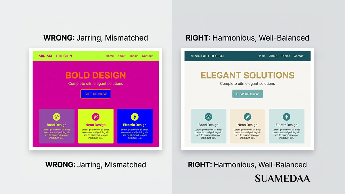
Hue, the pure color itself, tends to get the most attention in color theory discussions, but saturation and value, meaning intensity and lightness, do just as much work in shaping how a design feels. A fully saturated, high contrast palette feels bold, youthful, and energetic, while a desaturated, muted palette feels sophisticated, calm, or vintage, depending on the specific tones involved. Two designs can use the exact same hues and feel completely different simply because one leans into vibrant saturation and the other softens everything into muted, dusty tones. This is why so many premium or luxury brands favor desaturated, low contrast palettes, the restraint itself signals confidence and quality, while a loud, highly saturated palette often reads as budget or mass market by comparison.
The 60-30-10 Rule
One of the most practical tools in applied color theory is the 60-30-10 rule, a simple proportional guideline for distributing color across a design. Sixty percent of a composition should use a dominant color, typically a neutral or a primary brand color that establishes the overall tone. Thirty percent should use a secondary color that supports the dominant tone without competing with it. The remaining ten percent should be reserved for an accent color, used sparingly on the elements that most need to draw attention, such as a call to action button or a key data point in a chart. This rule works because it mimics how the eye naturally processes a scene: a stable base, a clear supporting layer, and a small amount of contrast to guide focus, rather than several competing colors all fighting for equal attention.
Cultural Context Changes Everything
Color theory’s core relationships, complementary contrast, analogous harmony, warm versus cool temperature, hold up remarkably well across contexts, but the specific meaning attached to individual colors is far from universal. White signals purity and simplicity in much of the Western world, but is traditionally associated with mourning in parts of East Asia. Red signals danger or urgency in many Western contexts, yet represents luck, prosperity, and celebration throughout Chinese culture. Designing for a global or unfamiliar audience means checking not just whether a palette follows sound color theory principles, but whether the specific colors chosen carry the intended meaning for the people who will actually see the design.
Accessibility Is Part of Color Theory Too
A palette can follow every rule of hue relationships and still fail a meaningful portion of its audience if it ignores contrast and colorblindness. Roughly one in twelve men and a smaller percentage of women experience some form of color vision deficiency, most commonly difficulty distinguishing red from green. Designs that rely on color alone to convey critical information, a red versus green status indicator with no additional label or icon, for instance, will simply be invisible to a meaningful slice of any audience. Sufficient contrast between text and background is equally essential, both for readers with low vision and for anyone viewing a screen in bright sunlight. Modern design tools now typically include built in contrast checkers and colorblindness simulators, and running any finished palette through one of these tools is a fast, low effort way to catch problems before they reach real users.
Putting It Into Practice
None of this theory needs to be memorized in order to be useful. A practical approach for most projects starts with picking one dominant color that matches the emotional tone the project needs, warm or cool, saturated or muted, then choosing a color relationship, complementary for energy and contrast, analogous for calm cohesion, or triadic for balanced vibrancy, to build out a small supporting palette. From there, the 60-30-10 rule offers a starting point for how much of the design each color should occupy, and a quick accessibility check ensures the final result works for as many viewers as possible. Design tools like Adobe Color, Coolors, and Paletton can generate color relationships automatically once a starting hue is chosen, taking much of the manual calculation out of the process entirely.



The feeling that a design “just works” is rarely an accident, and it is almost never pure intuition either. It is the product of specific, learnable relationships between hue, saturation, value, and proportion, relationships that have been studied and refined since Newton first arranged colors into a wheel centuries ago. Once those relationships become visible, the mystery starts to disappear, and what once felt like unexplainable good taste becomes a toolkit that can be applied deliberately, project after project.