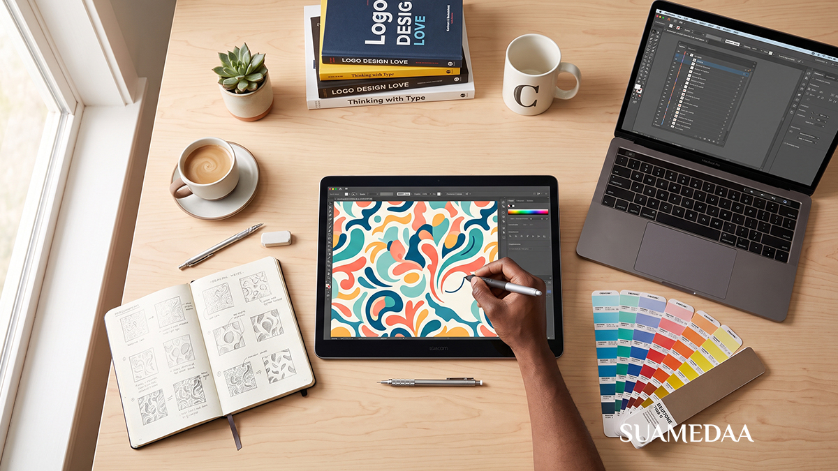
From Pixels to Profit – A Beginner’s Roadmap to Graphic Design Mastery
You have just opened a design application for the first time. The canvas is white and empty. The toolbar is full of tools you have not yet learned. Somewhere on the internet, someone is building a career doing exactly what you want to do, making logos, designing brand identities, laying out magazines, creating social media visuals, building packaging that stops people in a supermarket aisle. You want to do that. You just do not yet know how to get from where you are to where they are.
This roadmap is the answer to that question. It is written for the person at the beginning, the one who is genuinely starting from scratch or close to it, who has a desire to work in visual communication but has not yet built the foundation of skills, knowledge, and professional practice that a career in graphic design requires.
There are no shortcuts in this guide. Graphic design mastery is a long-term project. But there is a clear, logical sequence of steps that, followed with genuine effort and consistent practice, will take you from someone who admires good design to someone who creates it and earns a living doing so. That sequence begins here.



Understanding What Graphic Design Actually Is
Before you open any software or watch any tutorial, it is worth being clear about what graphic design is and what it is not, because many beginners carry a misconception that costs them years of misdirected effort.
Graphic design is not primarily about making things look beautiful. It is about visual communication: using image, type, color, space, and form to convey a specific message to a specific audience in a specific context. A logo that looks stunning but does not communicate the right thing about a brand has failed as design, regardless of its aesthetic quality. A poster that grabs attention and communicates its message immediately has succeeded, even if its style is deliberately rough or unconventional.
This distinction matters because it redirects your learning from the beginning. You are not training to become someone who makes pretty pictures. You are training to become a visual problem-solver: someone who receives a communication challenge and responds with a visual solution that is both appropriate and effective. Aesthetic quality is part of that, but it is in service of communication, not an end in itself.
Understanding this from the start shapes everything: how you approach a brief, how you evaluate your own work, how you talk to clients, and how you build a body of work that demonstrates genuine professional value rather than just personal taste.
Stage One: Learn the Foundations Before You Touch the Software
The single most common mistake beginning designers make is opening design software before they understand design principles. They spend weeks learning keyboard shortcuts and menu locations and then wonder why everything they make looks wrong. The software is not the problem. The missing foundation of design theory is.



Before you invest significant time in any application, build your understanding of the following foundational areas.
The Elements of Design
Design is built from a set of basic visual elements. Understanding what each one is and how it behaves is the starting point for everything that follows.
Line is the most fundamental mark-making element. In design, line can define edges, create movement, separate sections, guide the eye, and carry enormous expressive weight depending on its weight, direction, and quality. A thin horizontal line reads very differently from a bold diagonal one.
Shape is any enclosed area defined by line, color, or contrast. Shapes carry psychological associations: circles suggest wholeness and inclusivity, squares and rectangles suggest stability and reliability, triangles suggest tension, direction, or dynamism. Understanding how shapes communicate before you consciously choose them is a foundational design skill.
Color is covered in its own section below because its depth justifies separate treatment. For now, note that color is both perceptual and psychological: it affects how we see space and form, and it carries associations that vary by culture, context, and audience.



Typography is the art and technique of arranging type. In graphic design, type is rarely neutral. The choice of typeface, size, weight, spacing, and arrangement communicates meaning independently of the words themselves. A headline set in a delicate serif typeface communicates something entirely different from the same headline set in a bold, condensed sans-serif.
Texture refers to the visual quality of a surface, whether literal tactile texture or the optical illusion of texture created through pattern and mark. Texture adds depth and material quality to designs that would otherwise feel flat.
Space is what surrounds and separates elements. Negative space, the area around and between design elements, is as compositionally active as the elements themselves. Designs that ignore space produce cluttered, visually anxious work. Designs that use space deliberately create hierarchy, emphasis, and breathing room.
Form is the three-dimensional counterpart to shape, relevant particularly in product design, packaging, and three-dimensional typographic work.
The Principles of Design
The elements are the vocabulary. The principles are the grammar: rules and tendencies that govern how elements can be combined effectively.
Hierarchy determines what the viewer sees first, second, and third. A well-designed composition has a clear visual hierarchy that guides the eye through information in the intended order. Hierarchy is created through scale, color, contrast, position, and weight.
Contrast makes elements distinguishable from each other and from their backgrounds. High contrast creates emphasis and legibility. Low contrast creates subtlety and softness. A design with no contrast is a design with no focal point.
Alignment creates order and visual coherence. Elements that share an alignment axis feel organized and intentional. Elements that are arbitrarily placed feel accidental and amateurish. Invisible alignment grids are the organizing structure behind almost all professional design.
Repetition and consistency create unity. Repeating visual elements, whether colors, typefaces, shapes, or spacing values, ties a design together and makes it feel like a coherent system rather than a collection of unrelated pieces.
Proximity groups related information. Elements placed close together are perceived as belonging together. Elements placed apart are perceived as separate. Managing proximity is how you help viewers understand the structure and relationships within a piece of information.
Balance distributes visual weight across a composition. Symmetrical balance is formal and stable. Asymmetrical balance is dynamic and contemporary. Radial balance organizes elements around a center point. Unresolved imbalance creates tension, which can be deliberate and effective or accidental and distracting depending on the designer’s intention.
Rhythm creates movement and flow through repeated or varied elements. Like musical rhythm, visual rhythm can be regular and predictable or syncopated and surprising.
Proportion and scale govern the size relationships between elements. Dramatic scale contrast creates visual interest and emphasis. Even, undifferentiated scale creates monotony.
Learn these principles from books, from online resources, and above all from studying real design. Spend time looking at work you admire and identifying which principles are at work. Ask not just what you like but why it works. The ability to analyze design visually is the precursor to the ability to create it deliberately.
Stage Two: Develop Your Eye Before You Develop Your Hand
Becoming a designer requires developing a visual sensibility, the ability to look at the world with a trained eye that notices composition, color, typography, and spatial relationships in everything from a film poster to a cereal box. This sensibility develops through deliberate, active looking rather than passive consumption.
Build a Design Archive
Create a personal archive of design work that moves you: save images to a folder, maintain a board on Pinterest or Are.na, keep a physical scrapbook of things torn from magazines and printed materials. Do not just collect things you think are technically excellent. Collect things that affect you, that feel surprising, that solve problems elegantly, that use a visual approach you have not seen before.
Return to this archive regularly and look at it critically. What exactly is working in each piece? Which typefaces are being used and why do they feel right? How is the color palette structured? Where does the eye move when you look at the composition? What would happen if you changed one element?
This kind of active analysis, conducted regularly over months and years, builds the visual library that experienced designers draw on automatically when they approach a new problem.
Study Design History
Graphic design has a rich history that directly informs contemporary practice. Understanding where visual conventions come from, which movements introduced which ideas, and how design has responded to broader cultural and technological shifts, gives you a context for your own work that purely contemporary study cannot provide.
The key movements and periods worth studying include the Arts and Crafts movement of the late 19th century, Art Nouveau, the Bauhaus school whose influence on modern design cannot be overstated, Swiss International Typographic Style also known as Swiss Design, American postwar advertising design, the psychedelic design of the 1960s, Postmodernism in the 1980s, and the digital revolution from the 1990s onward.
Key figures worth studying include Paul Rand, Saul Bass, Josef Muller-Brockmann, Herb Lubalin, Milton Glaser, Massimo Vignelli, Paula Scher, David Carson, and Stefan Sagmeister. Each represents a distinct approach to visual communication and studying their work alongside the context in which it was created accelerates the development of your own design thinking.
Study Typography Deeply
Typography deserves its own focused study because it is both technically complex and extraordinarily powerful. Poor typography is the most reliable indicator of inexperienced design. Excellent typography is one of the clearest marks of mastery.
Begin by understanding type anatomy: the terminology used to describe the parts of letterforms, including baseline, cap height, x-height, ascender, descender, serif, stem, bowl, counter, and terminal. Understanding anatomy helps you see and evaluate typefaces more precisely.
Learn the major type classifications: serif, sans-serif, slab serif, script, display, and monospace. Understand the historical context of each and the associations they carry. Old style serifs suggest tradition, authority, and literary heritage. Geometric sans-serifs suggest modernity, neutrality, and technical precision. Scripts suggest personalization, elegance, or informality depending on their style.
Learn about type hierarchy: how to establish clear levels of information using size, weight, style, and color. Learn about leading (the space between lines), tracking (the overall spacing between characters in a block of text), and kerning (the adjustment of space between specific character pairs). These micro-decisions are invisible when executed correctly and immediately visible when neglected.
Study how type and image work together. Learn when type should be set over an image and when it should be separated. Learn how to choose a typeface that is in dialogue with the visual content rather than fighting against it.
Understand Color Theory
Color is one of the most emotionally powerful tools available to a designer and one of the least understood by beginners, who often approach it purely by instinct and personal preference.
Begin with the color wheel and the basic relationships it describes: complementary colors that sit opposite each other and create maximum contrast, analogous colors that sit adjacent and create harmony, triadic colors that form an equilateral triangle and create vibrant balance, and split-complementary palettes that modify the contrast of true complementary pairs.
Understand the dimensions of color: hue (which color it is), saturation (how intense or muted it is), and value (how light or dark it is). Most color errors in design involve insufficient attention to value contrast rather than hue selection. A palette that looks harmonious in full color can become illegible when rendered in greyscale if the values of adjacent colors are too similar.
Understand color in context. Colors read differently depending on what surrounds them. The same grey placed against a warm background will appear cool, placed against a cool background it will appear warm. Color is relational, not absolute. This principle, demonstrated compellingly by Josef Albers in his series “Interaction of Color,” is one of the most practically important ideas in color theory.
Understand color psychology and cultural associations. Red in Western contexts often suggests urgency, danger, or passion. In Chinese culture, it suggests luck and celebration. White in Western contexts suggests purity and cleanliness. In many Asian cultures, it is associated with mourning. Designing for specific audiences requires understanding how those audiences read color associations, which may be entirely different from your own.
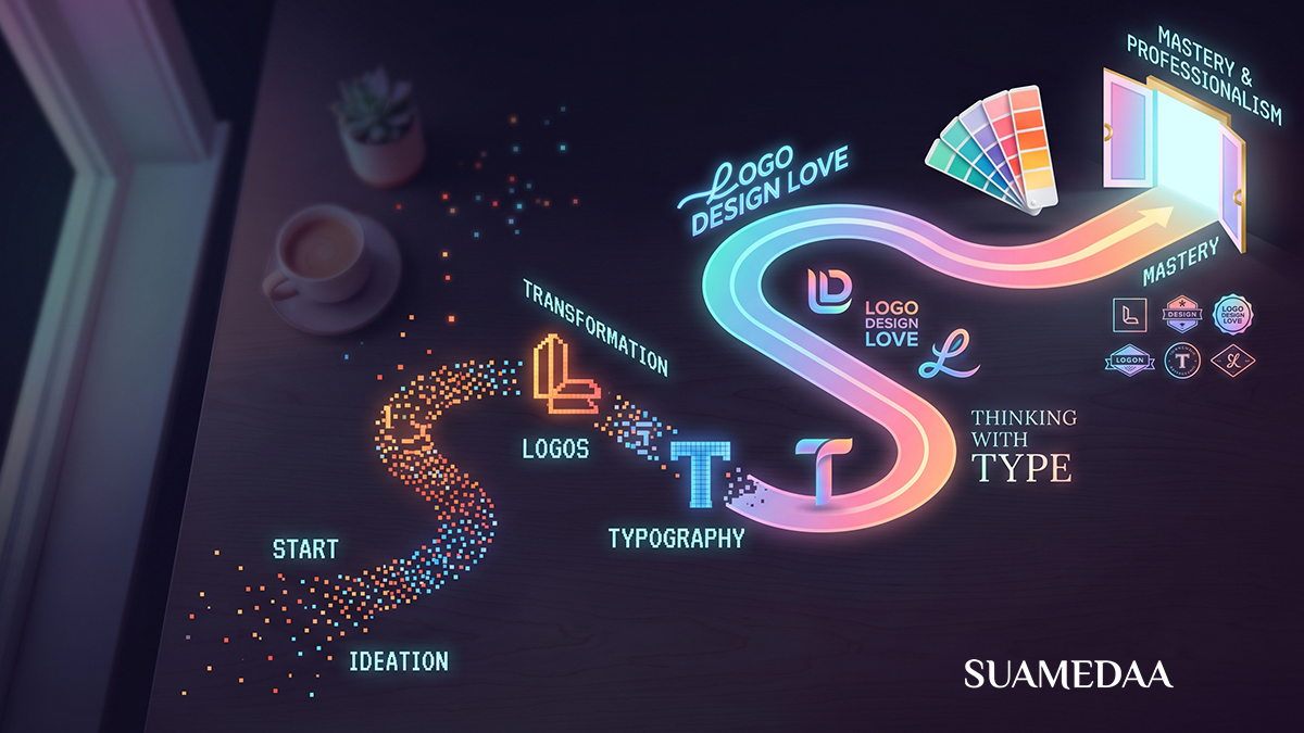
Stage Three: Learn the Software
With a foundation in design principles, visual analysis, typography, and color theory in place, you are ready to approach software effectively. Now the tools serve your understanding rather than substituting for it.
The core software ecosystem for professional graphic design in 2026 is still dominated by Adobe’s Creative Cloud suite, though strong alternatives have emerged and, in some areas, overtaken Adobe for specific tasks.
Adobe Illustrator
Illustrator is a vector graphics application: it creates artwork from mathematical paths rather than pixels, meaning designs can be scaled to any size without loss of quality. It is the industry-standard tool for logo design, icon design, illustration, and any work that needs to be reproduced at multiple sizes from a business card to a billboard.
Begin with Illustrator by mastering the Pen tool, which is initially the most challenging and ultimately the most essential instrument in the vector design toolkit. The Pen tool draws precise paths that can be shaped, modified, and combined into any form imaginable. Fluency with the Pen tool separates designers who can execute almost any visual concept from those limited by their tools.
Learn shape construction, the Pathfinder and Shape Builder tools for combining and subtracting shapes, how to work with color and gradients, how to place and manage typography, and how to use the Layers panel to organize complex artwork. Learn how to export files in the formats appropriate to different end uses: vector PDF for print, SVG for web, PNG for screen applications where transparency is needed.
Adobe Photoshop
Photoshop is a raster graphics application: it works with pixels and is the industry-standard tool for photo editing, retouching, compositing, digital painting, and the creation of raster-based design elements. Any project involving photography, whether editing images for use in a design or creating photographic composites and manipulations, requires Photoshop fluency.
Begin with the fundamentals: understanding layers and layer masks, using adjustment layers for non-destructive color and tone correction, the basic selection tools and how to make precise selections around complex edges, retouching tools for removing blemishes and distractions, and the smart object workflow that allows embedded elements to be edited non-destructively.
As you advance, learn compositing techniques: how to combine images from different sources convincingly by matching light direction, color temperature, and perspective. Learn frequency separation for skin retouching. Learn how to use Camera Raw for processing raw image files. These are the skills that enable photo-realistic compositing and advanced image manipulation.
Adobe InDesign
InDesign is a page layout application designed for multi-page documents: brochures, books, magazines, annual reports, catalogues, and any print or digital publication that involves multiple pages of text and image combined. It handles long-form typography and document structure in ways that Illustrator and Photoshop are not designed for.
Learn the fundamental InDesign workflow: setting up document grids and margins, creating master pages for consistent page elements, placing and flowing text through threaded text frames, placing and sizing images, and managing styles for consistent paragraph and character formatting throughout a long document. Learn how to preflight a document for print, package it correctly for sending to a print supplier, and export it in the appropriate PDF preset for different print specifications.
Figma
Figma has become the dominant tool for user interface design, web design, and collaborative digital design work. Unlike the Adobe applications, Figma runs in the browser and is natively collaborative, meaning multiple designers can work on the same file simultaneously, and clients can view and comment on designs without installing any software.
If your design interests include digital products, websites, apps, or any screen-based design, Figma is now effectively a required skill. Learn component-based design, where repeatable elements are built once and used throughout a design as linked instances that update everywhere simultaneously when the master is changed. Learn auto layout, which allows designs to respond intelligently to content changes in ways that static design tools cannot. Learn prototyping, which allows interactive flows to be demonstrated to clients and developers without writing any code.
Canva as a Starting Point
For absolute beginners who need to build confidence with visual layouts before committing to the learning curve of professional tools, Canva is a reasonable starting point. It is template-driven, browser-based, and accessible without any prior design knowledge. Its limitations are also its educational value: the constraints of a template-based system teach basic layout and hierarchy decisions without the cognitive overhead of a professional application.
Be honest with yourself about when you have outgrown Canva. For professional client work, portfolio development, and any project requiring precise control over output quality, Canva will eventually become an obstacle rather than a tool. The transition to professional applications should happen sooner rather than later in your development.
Stage Four: Practice with Real Projects
Software fluency without project experience is like vocabulary without sentences. The skills only develop fully in the context of real work: real constraints, real objectives, real audiences, real feedback.
Self-Initiated Projects
In the early stages, before you have clients, create your own briefs. The quality of a self-initiated project depends heavily on the quality of the brief you write for yourself. Vague briefs produce unfocused work. Specific, well-considered briefs produce focused work that develops real skills.
Design a brand identity for a fictional business in an industry that interests you. Redesign a real brand whose current identity you think is underperforming, being clear about the specific problems you are solving and the audience you are designing for. Create a poster series for a real cultural event or cause. Design a book cover for a novel you love. Lay out a short magazine feature on a subject you find interesting.
Each project should produce not just finished artwork but a process record: your initial research, your early sketches and concepts, your rationale for the direction you chose, and your final execution. This process documentation will be essential for your portfolio later.
Volunteer and Collaborative Work
Offer design help to non-profit organisations, community groups, local businesses, or school events. Volunteer work provides real briefs, real constraints, real stakeholders, and real deadlines without the full pressure of professional client relationships. It also begins building your reputation and network within your community.
Be clear from the outset about the scope of what you are offering and the timeline in which you can deliver it. Even volunteer projects benefit from professional conduct: regular communication, meeting agreed deadlines, and presenting work with a brief explanation of your design rationale.
Competitions and Briefs Platforms
Design competitions and student brief platforms provide structured creative challenges with defined parameters and the motivation of external evaluation. D&AD New Blood, Cannes Lions Young Lions, ADC Young Guns, and similar competitions offer real briefs from real organisations and the opportunity to have your work evaluated by industry professionals. Winning or placing in credible competitions carries genuine weight on a portfolio.
Even without placing, the discipline of responding to a competition brief, designing within its constraints, and submitting your work for external evaluation develops the professional muscle of working under pressure toward a defined goal.
Stage Five: Build a Portfolio That Works
Your portfolio is the primary instrument through which potential clients and employers evaluate your work and decide whether to engage you. A strong portfolio does not require a large quantity of projects. It requires a small number of projects executed to a high standard, presented clearly, and curated to demonstrate the skills most relevant to the clients or employers you are targeting.
Quality Over Quantity
Eight to twelve projects is sufficient for a strong early portfolio. Twelve mediocre projects are a weaker portfolio than six excellent ones. Curate ruthlessly. If a project does not represent the level of work you are capable of right now, do not include it simply to add volume.
Show Process, Not Just Finals
The most convincing portfolios show how you think, not just what you made. Include process documentation: research, sketches, early concepts, iterations, and the rationale behind your final direction. Showing process demonstrates that your results are deliberate rather than accidental, and it makes your portfolio far more interesting to experienced designers and creative directors who understand and value the design thinking behind the finished work.
Present Work in Context
Use mockups to show your work in realistic context: logos on business cards and signage, packaging on shelves, app interfaces on device screens, print work on tables or in people’s hands. Contextual presentation helps viewers immediately understand the purpose and scale of the work and makes it significantly more persuasive than flat, isolated artwork on a white background.
Choose Your Platform
Portfolio websites can be built using dedicated platforms like Behance, Cargo, Format, or Squarespace, or with custom-coded websites for designers with web development skills. Behance has the advantage of an existing audience within the design community and is integrated with Adobe’s Creative Cloud ecosystem. Custom websites offer complete control over presentation and demonstrate additional technical capability.
Whatever platform you choose, prioritize clarity of navigation, fast loading, and the quality of the presentation over the cleverness of the design. A portfolio website’s job is to show your work, not to show off its own design.
Stage Six: Understanding the Business of Design
Design skill without business literacy produces talented designers who are chronically underpaid, undervalued, and frustrated. Understanding how to operate as a design professional, whether freelance or employed, is as important as understanding how to design.
Pricing Your Work
Pricing is the subject most beginning designers feel least equipped to handle and most afraid to approach. The root of that fear is usually a lack of frameworks for thinking about value.
There are three primary pricing models in common use in graphic design. Hourly pricing charges for the time invested in a project. It is transparent and easy to calculate but can penalize efficiency: the faster you work as you develop skill, the less you earn per project at the same hourly rate. Project-based pricing charges a fixed fee for a defined scope of work. It rewards efficiency and aligns with how clients prefer to budget, since they know the cost in advance. Value-based pricing charges based on the value the design delivers to the client rather than the time it takes to produce. A logo for a startup that will use it for ten years on all its communications is worth considerably more than the hours spent designing it.
Research market rates in your region and for your level of experience. Talk to other designers about what they charge. As you develop your portfolio and client list, raise your rates. Undercharging is not a viable long-term strategy: it attracts clients who do not value design, produces financial stress that undermines your creative work, and signals to the market that your work is not particularly valuable.
Contracts and Scope
Every professional design project, regardless of client size or project scale, should begin with a written agreement. A design contract does not need to be a complex legal document. It does need to cover: the scope of work, what you are delivering and what you are not; the timeline, when deliverables are due and when you need client feedback; the fee, including your payment schedule and any additional charges for out-of-scope requests; the number of revision rounds included; and the ownership of the final work, clarifying when copyright transfers to the client.
Scope creep, the gradual expansion of a project beyond the originally agreed parameters, is one of the most common sources of financial loss and professional frustration in freelance design. A clear contract with a defined scope, combined with the professional habit of flagging and pricing additional requests before executing them, protects both you and the client.
Client Communication
The ability to communicate clearly and professionally with clients is a skill that distinguishes working designers from talented people who struggle to build a sustainable practice. Learn to ask the right questions at the briefing stage, to present your work with a clear verbal explanation of your design rationale, to receive critical feedback without becoming defensive, and to push back professionally when a client request would genuinely harm the effectiveness of the work.
The designer who can explain why a design decision serves the client’s objective carries far more authority than the one who simply defers to client preferences in every situation. Clients hire designers because they trust their visual judgment. That trust is built through clear, confident, well-reasoned communication about design decisions.
Invoicing and Financial Management
Set up a simple system for issuing invoices promptly, tracking outstanding payments, and following up on late-paying clients professionally but persistently. Late payments are a significant problem in the freelance creative industry. Requiring a deposit, typically between 25 and 50 percent of the total project fee, before beginning work is standard practice and reduces the financial risk of clients who disappear before a project is completed.
Keep clear records of your income and expenses from the beginning of your freelance practice. Tax obligations for self-employed creatives vary by jurisdiction but are universally easier to manage with good records maintained throughout the year than reconstructed in a panic at year end.
Stage Seven: Growing into Mastery
The early stages of design education are about acquisition: absorbing principles, developing software fluency, building a portfolio. Mastery, which takes years rather than months, is about depth: going further into areas of particular interest, developing a genuine point of view, building a body of work that reflects a consistent and evolving creative intelligence.
Develop a Specialisation
The design field is broad. Logo and brand identity, editorial and publication design, packaging design, motion graphics, user experience design, environmental and signage design, illustration, type design, and many other specialisations exist within it. Generalists are valuable, particularly in small studios and early-career contexts. But specialists command higher fees and more interesting work as they develop deep expertise in a specific area.
Pay attention, as you gain experience, to which type of work energises you most. Where do you find yourself going deeper than the project requires? Where do your best ideas come from most naturally? These signals point toward your specialisation. Follow them.
Seek Critique and Community
Isolated practice develops at a fraction of the speed of practice conducted within a community of peers. Seek critique from designers whose work you respect. Join design communities online and in person. Attend industry events, talks, and exhibitions. Mentor newer designers, because teaching accelerates learning.
Critique is not always comfortable, particularly in the early stages when your confidence in your own judgment is still developing. Learn to receive it with the goal of extracting what is useful rather than defending your choices. The designer who can use critical feedback to improve work is developing faster than the one who treats every critique as an attack.
Keep Learning
Design is a field that evolves continuously. New tools emerge and gain adoption. Visual trends shift. Technology opens new possibilities and closes old ones. The designer who stops learning at any point begins to fall behind, not dramatically or immediately, but gradually and unmistakably.
Read widely: design books, design journalism, cultural criticism, business books, books about the industries your clients work in. Look at art, film, architecture, fashion, and music with the same active analytical attention you bring to design. The best ideas in design come from the collision of visual training with broad cultural engagement.
The Distance Between Pixels and Profit
There is no honest way to promise that the journey from beginner to profitable design professional is short. It is not. Building genuine skill in any visual discipline takes sustained effort over years, not weeks. The designers who earn well and build careers they find meaningful are those who accepted that timeline and committed to the work anyway.
What this roadmap offers is not a shortcut but a direction: a clear sequence of stages that builds each skill on the foundation of what precedes it, that connects technical learning to real-world application, and that treats the business of design as inseparable from the craft of it.
The distance between pixels and profit is crossed one decision at a time: the decision to study principles before opening software, to analyze work before producing it, to practice on real projects before seeking clients, to price according to value rather than insecurity, and to keep developing long after the basics are in place. Begin where you are. Learn what comes next. Make the work. The rest follows from that.